

✋Everything you see and feel here. here’s what they mean.
The iconic “Y”
It’s not just a stylized “Y” letter. It’s what we represent. It’s who we are.
A diamond that symbolizes wealth, winning, achievement, success, and wisdom over time. A check saying “Yes to prosperity.”
💰We’re about prosperity. It’s about time to flip the pyramid by enriching more people — the inverted pyramid. 💵 Our intention is to grow our members and the Filipinos.
An arrow — Yaman directs your path to wealth and happiness through knowledge and patriotism.
Y is for Yes; We say yes to advocacy, to knowledge, to financial abundance.
The touch of green
Our color is green — and its shades because it represents growth, harmony, and prosperity.
To end poverty is to hope, to grow, to harmonize, and to prosper — all said in one color, green.
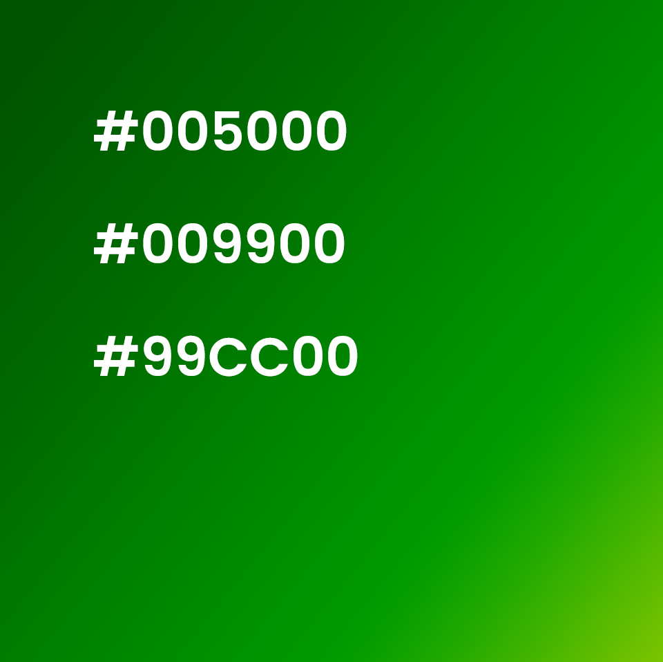
#005000 Green for growth
Green is inherently linked to nature, symbolizing growth, fertility, and renewal. This connection can evoke feelings of peace, tranquility, and a sense of being grounded.
#009900 Green for harmony
Green is considered the great balancer of the heart and emotions, promoting equilibrium.
#99CC00 Green for prosperity
Green can symbolize wealth and prosperity, particularly when associated with money.
#OtherShades Green for hope and optimism
Green, particularly lighter shades, can evoke feelings of hope and optimism.
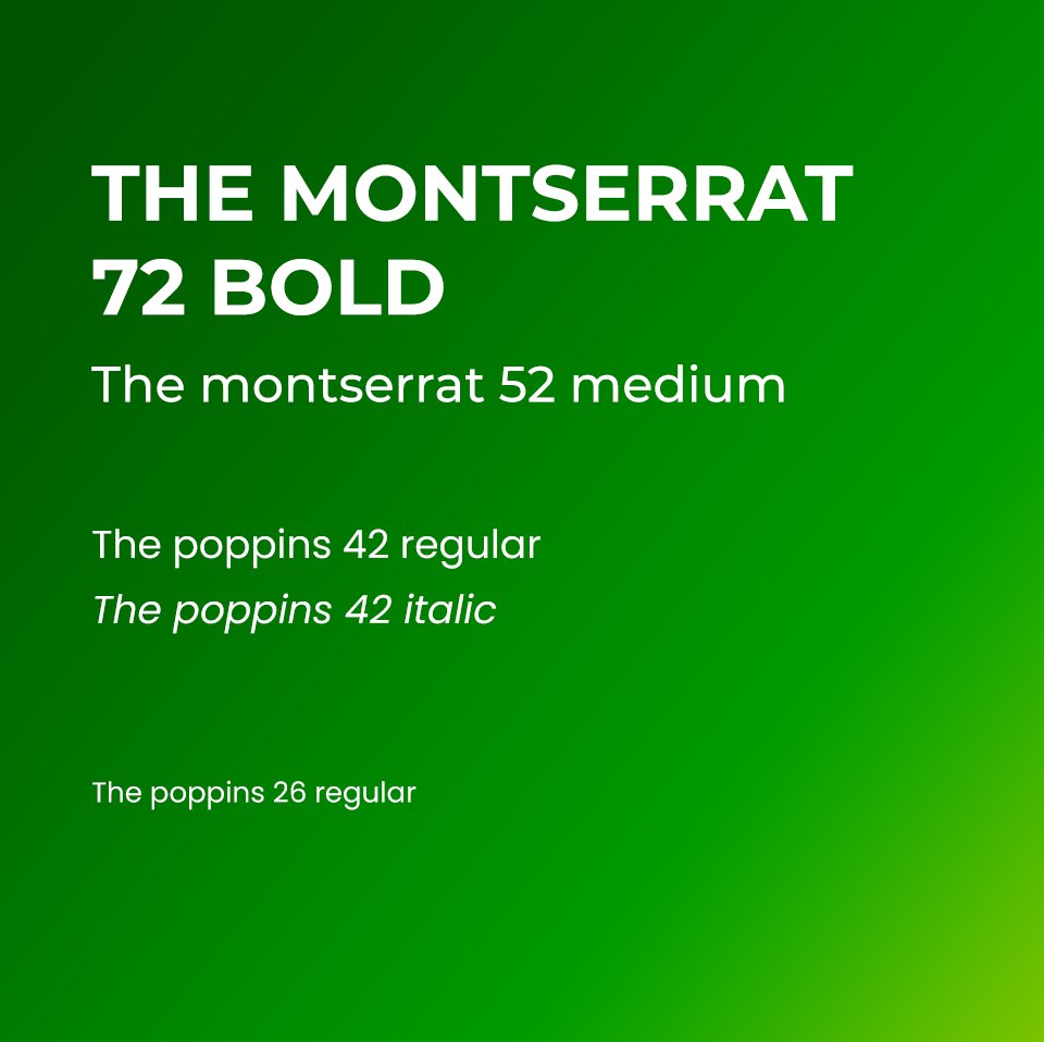
Unbounded is cool, clean, and clear
We chose Sans Serif font for clarity and cleanliness.
Modern font system. Clean copy. Straightforward but unassuming. Still respectful.
We are the modern-day presentation of an ever-evolving cooperative.
This font, Unbounded, represents our desire to challenge the status quo by championing “a better way to live.”
Live. Alive. Ready to change the way people see (and experience) the world. Excited. Sometimes, rebellious.
Unafraid. Confident. But still cool.
Zalando Sans. Bold or Bold Italics.
Well-balanced. Firm. But smooth. Zalando Sans and Unbounded stand wide and tall giving impressions of stability, strength, and well-roundedness.
This is who we are.
Our font system can tell.

Enrich the people.
Enrich the people tagline
It’s the people, the people, the people.
🩰Who you travel with matters. What happens when you travel matters. How you travel matters.
💕Yakap sa Mamamayan Advocacy Cooperative travels with you. Through our uniquely crafted programs, you won’t have to chase success alone.
Enrich. Pagyamanin. Hindi lang ang isip. O puso. Kundi ang buhay.
With Yaman, we enrich the people.
Acknowledgment
All designs, including the logo, the logo marks, the icons, creative designs, the tagline, the entire copy in this website and the eventual print version of any of these visual marks are made, created, and owned by Lloyd Luna.